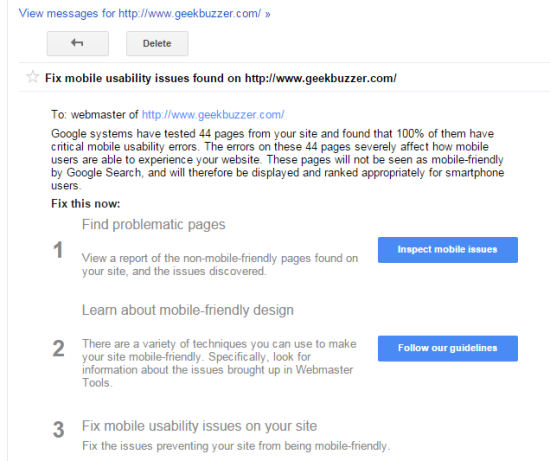
Google announced there mobile friendly update on April 21st which boosts the ranking of mobile friendly pages on mobile search. Even when you open your Google webmaster panel you will be able to see a message “Fix mobile usability issues found on this Site” if your Site is not mobile friendly.
Here are some key points of Google’s Mobile Friendly Algorithm Update:
-
This is a real-time algorithm which means that if you have not updated your WordPress Site’s theme for mobile version then you can update it any time. You don’t need to send a separate request in webmaster tools for site reconsideration.
-
As soon as you are done with making your WordPress site mobile friendly, your WordPress site pages will be treated as mobile friendly. It will be crawled and indexed again or you can manually Fetch as Google with Submit to Index in Google webmasters.
-
It’s a page level change which means if 2o out of 50 pages of your WordPress site are mobile friendly then those 20 pages will be positively benefited from this update. It will affect pages not entire website.
-
Mobile friendly update has no impact on searches made from desktop or tablets. It affects only on searches made from mobile device that is why it is considered more deadly than Google’s panda and penguin algorithms.
-
This update affects 40% of mobile search queries where as panda update lead to affect 12% of all English queries and penguin update lead to 4% of all global queries across both mobile and desktop.
-
This update affects search ranking on mobile devices, affects global search queries in all languages and it affects individual pages not entire website.
If you received similar message, then you can test for mobile friendliness of your WordPress Site or it’s individual pages using mobile friendly test. If your WordPress Site is not mobile friendly you will be able to see something like this. 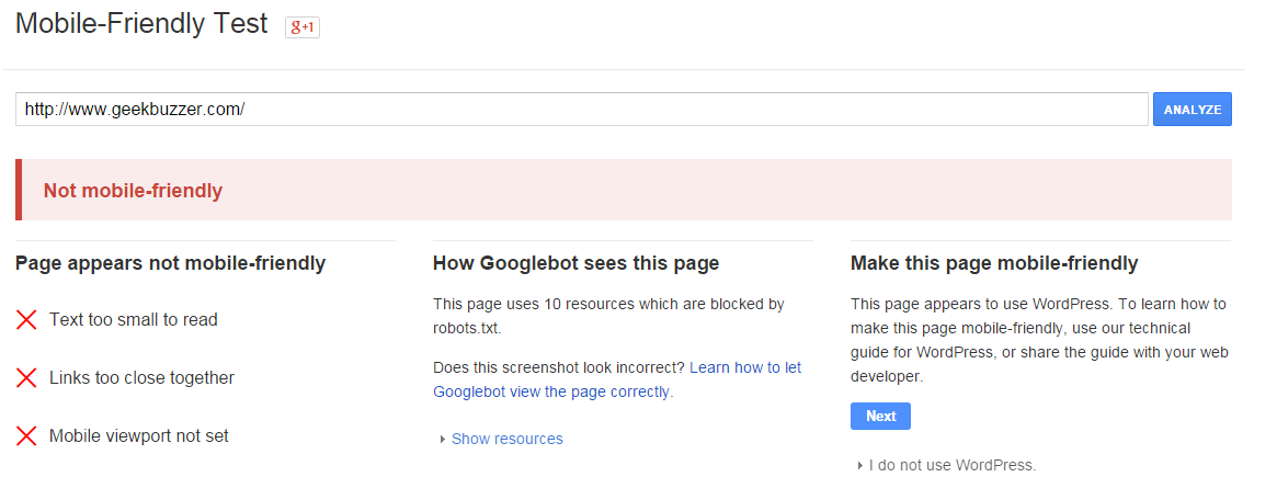
Here are some of the problems:
-
Text too small to read: Your WordPress Site’s font size is too small.
-
Links too close together: It means links or touch elements are too close that user leads to misclicking.
-
Mobile viewport not set: It means that your website is not automatically scalable to any size.
Make Your WordPress Site Mobile Friendly Using WP Touch Plugin
-
After Logging into your WordPress Dashboard, click on Plugins -> Add New .
-
Search for “WPTouch“, then install and activate the plugin.
- After that you will be able to see WPtouch icon on left pane.
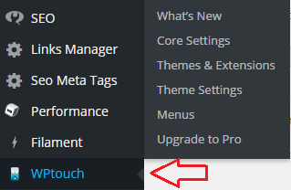
Navigate to WPtouch -> Core Settings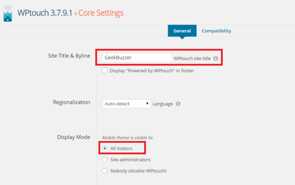
Site Title & Byline section : Enter title of your WordPress Site here.
Display Mode : All visitors
Leave all other options as default and click on “Save Changes“.
-
Navigate to WPtouch -> Theme Settings -> Branding
Site Logo : Upload your WordPress Site’s logo in this section.
Floater Social Links : Enter all your WordPress Site’s social media handles or usernames in this section.
Leave all other options as default and click on “Save Changes”.
-
Now your WordPress Site is mobile friendly but if left menus and “load more entries” is not working. It occurs when any of WordPress plugin is using outdated JQuery.
-
You can simply update JQuery using JQuery Updater plugin. Search and install “JQuery Updater” and activate it.
You are done. -
Now using chrome browser
-
Click on the Chrome menu and then select More Tools >> Developer Tools.
-
Click on the Toggle device mode icon. When device mode is enabled, the icon turns blue and the viewport transforms into a device emulator.
-
Now you can check mobile view of your WordPress Site from here.

-
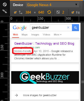
- Further you can perform a mobile search query using device mode in chrome to check whether your WordPress site is properly indexed for mobile search or not.
-
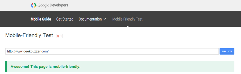
Finally you can validate mobile friendliness of your WordPress Site or its individual pages using mobile friendly test.
If you face any issue in this whole procedure, then drop a line in comments. If you find the information in this-post useful, then do share it with your friends via Facebook, Twitter and Google Plus.

Aakash Goyal
Latest posts by Aakash Goyal (see all)
- Demystifying Smart Shopping Campaigns - June 15, 2019
- The Definitive Guide to Czech Republic SEO - March 12, 2017
- 13 Best Points to Add in Your Content Marketing Checklist - August 8, 2016
Nice article..